The charts show information about the number of kilometres travelled in an average month and the distribution of vehicle types in Britain
The charts show information about the number of kilometres travelled in an average month and the distribution of vehicle types in Britain
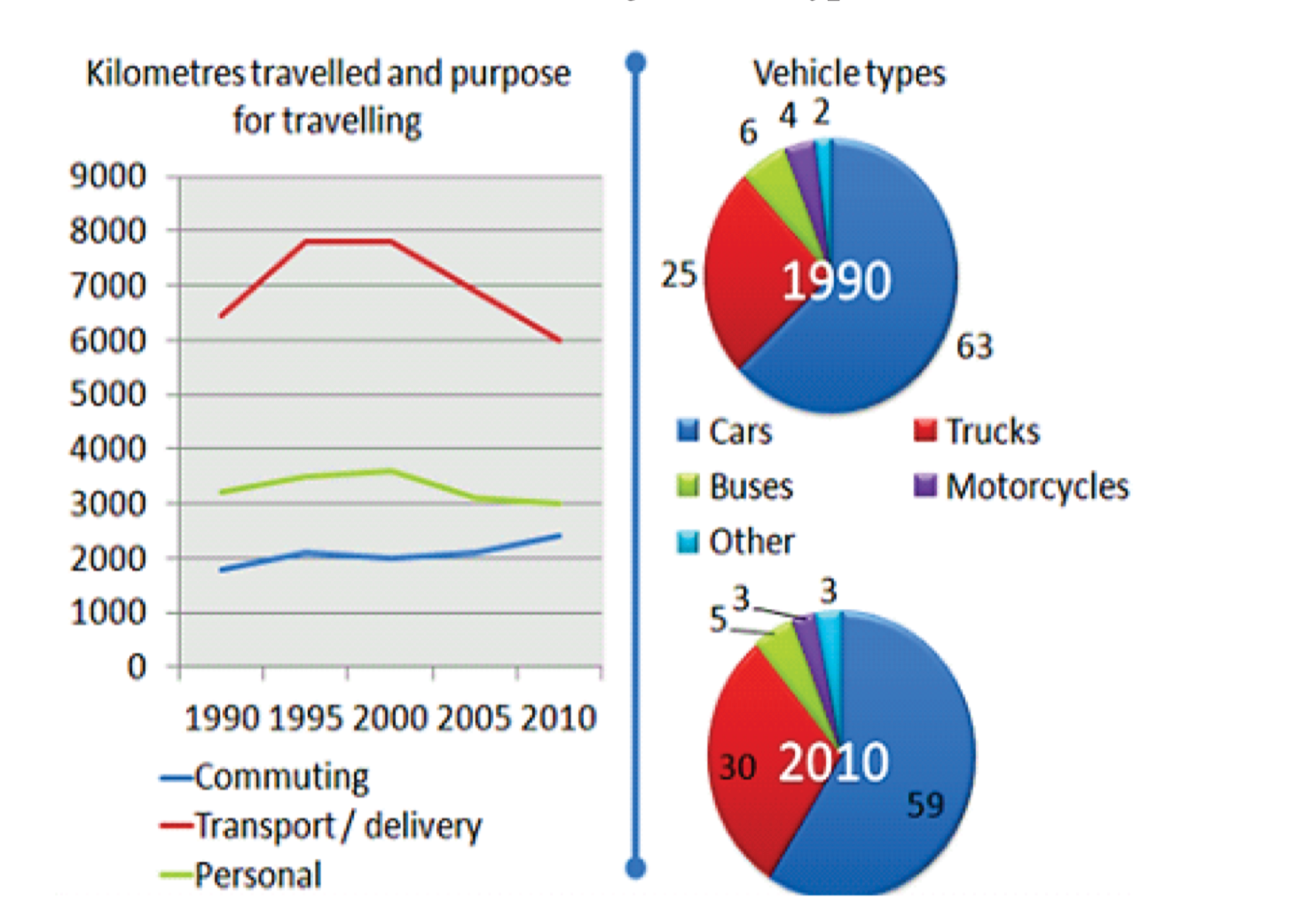
The pair of graph depict the amount of kilometres traveled using different type of vehicle in Britain.
Overall, it can be that vehicles are traveled most for transportation as well as delivery purpose, while for commuting vehicle travel very less. On the other hand, Cars is the most popular vehicle type and motor-cycle is the least used.
Looking at the line graph, for transportation purpose vehicle travelled most, stood at above 6000km in 1990, that increased noticeably to almost 7800 and then in year 1995 to 2000 the amount of kilometer of travel was remain consistent. By the year 2001, travel amount showed gradual decline. Over the time it decreased to 6000km in year 2010. For commuting and Personal personal purpose vehicle travelled less compared to transportation purpose. For commuting and purposer purpose vehicle traveled above 3000km and just slightly below 2000km, over time they faced some fluctuation, nevertheless by the year 2010, their travel kilometer amount reached to 3000 and just above 2000km.
Looking at the pie chart, it is evident that car is the most used vehicle for both year 1990 and 2000. For both year 1990 and 2000, car usage are 63 and 59 percent. Second most used vehicle is track, usage stood at 25% in 1990, reached to 30% in 2010. Buses, Motorcycles and Other type of vehicle are comparatively less used vehicle, 6%, 4%, 2% and 5%, 3%, 3% usage are spotted in given two years.